Consider the following
Trellis display of histograms of a response variable ($Z$), conditioned on two factors $(X, Y)$ that can each be low, medium or high:
The combined sample size for the nine plots is 10,000 observations. Would you agree with the following assessments?
- $Z$ seems to be normally distributed for medium values of either $X$ or $Y$ (or both).
- $Z$ appears to be negatively skewed when both $X$ and $Y$ are low (and perhaps when $X$ is low and $Y$ is high), and perhaps positively skewed when both $X$ and $Y$ are high.
- $Z$ appears to be leptokurtic when both $X$ and $Y$ are low.
What motivated this post is a video I recently watched, in which the presenter generated a matrix of conditional histograms similar to this one. In fairness to the presenter (whom I shall not name), the purpose of the video was to show how to code plots like this one, not to do actual statistical analysis. In presenting the end result, he made some off-hand remarks about distributional differences of the response variable across various values of the covariates. Those remarks caused my brain to itch.
So, are my bulleted statements correct? Only the first one, and that only partially. (The reference to $Y$ is spurious.) In actuality, $Z$ is independent of $Y$, and its
conditional distribution given
any value of $X$ is normal (
mesokurtic, no skew). More precisely, $Z=2X+U$ where $U\sim N(0,1)$ is independent of both $X$ and $Y$. The data is simulated, so I can say this with some assurance.
If you bought into any of the bulleted statements (including the "either-or" in the first one), where did you go wrong? It's tempting to blame the software's choice of endpoints for the bars in the histograms, since it's well known that changing the endpoints in a histogram can significantly alter its appearance, but that may be a bit facile. I used the
lattice package in
R to generate the plot (and those below), and I imagine some effort went into the coding of the default endpoint choices in the
histogram() function. Here are other things to ponder.
Drawing something does not make it real.
The presence of $Y$ in the plots tempts one to assume that it is related to $Z$, even without sufficient context to justify that assumption.
Sample size matters.
The first thing that made my brain itch, when I watched the aforementioned video, was that I did not know how the covariates related to each other. That may affect the histograms, particularly in terms of sample size.
It is common knowledge that the accuracy of histograms (and pretty much everything else statistical) improves when sample size increases. The kicker here is that we should ask about the sample sizes of the individual plots. It turns out that $X$ and $Y$ are fairly strongly correlated (because I made them so). We have 10,000 observations stretched across nine histograms. An average of over 1,000 observations per histogram should be enough to get reasonable accuracy, but we do not actually have 1,000 data points in every histogram. The scatter plot of the original covariates (before turning them into low/medium/high factors) is instructive.
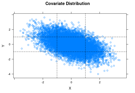
The horizontal and vertical lines are the cuts for classifying $X$ and $Y$ as low, medium or high. You can see the strong negative correlation between $X$ and $Y$ in the plot. If you look at the lower left and upper right rectangles, you can also see that the samples for the corresponding two histograms of $Z$ ($X$ and $Y$ both low or both high) are pretty thin, which suggests we should not trust those histograms so much.
Factors often hide variation (in arbitrary ways).
In some cases, factors represent something inherently discrete (such as gender), but in other cases they are used to categorize (pool) values of a more granular variable. In this case, I cut the original numeric covariates into factors using the intervals $(-\infty, -1]$, $(-1, +1]$ and $(+1, +\infty)$. Since both covariates are standard normal, that should put approximately 2/3 of the observations of each in the "medium" category, with approximately 1/6 each in "low" and "high".
To generate the plot matrix, I
must convert $X$ and $Y$ to factors; I cannot produce a histogram for each individual value of $X$ (let alone each combination of $X$ and $Y$). Even if my sample were large enough that each histogram had sufficiently many points, the reader would drown in that many plots. Using factors, however, means implicitly treating $X=-0.7$ and $X=+0.3$ as the same ("medium") when it comes to $Z$. This leads to the next issue (my second "brain itch" when viewing the video).
Mixing distributions blurs things.
As noted above, in the original lattice of histograms I am treating the conditional distributions of $Z$ for all $(X, Y)$ values in a particular category as identical, which they are not. When you mix observations from different distributions, even if they come from the same family (normal in this case) and have only modestly different parameterizations, you end up with a histogram of a steaming mess. Here the conditional distribution of $Z$ given $X=x$ is $N(2x, 1)$, so means are close if $X$ values are close and standard deviations are constant. Nonetheless, I have no particular reason to expect a sample of $Z$ when $X$ varies between $-1$ and $+1$ to be normal, let alone a sample where $X$ varies between $-\infty$ and $-1$.
To illustrate this point, let me shift gears a bit. Here is a matrix of histograms from samples of nine variables $X_1,\dots,X_9$ where $X_k \sim N(k, 1)$.
Each sample has size 100. I have superimposed the normal density function on each plot. I would say that every one of the subsamples looks plausibly normal.
Now suppose that there is actually a single variable $X$ whose distribution depends on which of the nine values of $k$ is chosen. In order to discuss the
marginal distribution of $X$, I'll assume that an arbitrary observation comes from a random choice of $k$. (Trying to define "marginal distribution" when the distribution is conditioned on something deterministic is a misadventure for another day.) As an example, $k$ might represent one of nine possible categories for undergraduate major, and $X$ might be average annual salary over an individual's working career.
Let's see what happens when I dump the 900 observations into a single sample and produce a histogram.
The wobbly black curve is a sample estimate of the density function, and the red curve is the normal density with mean and standard deviation equaling those of the sample (i.e., $\mu=\bar{X}, \sigma=S_X$). To me, the sample distribution looks reasonably symmetric but too
platykurtic (wide, flat) to be normal ... which is fine, because I don't think the marginal distribution of $X$ is likely to be normal. It will be some convolution of the conditional distribution of $X$ given $k$ (normal, with mean $k$) with the probability distribution for $k$ ... in other words, a steaming mess.
When we pool observations of $X$ from different values of $k$, we are in effect mixing apples and oranges. This is what I meant by "blurring" things. The same thing went on in the original plot matrix, where we treated values of $Z$ coming from different distributions (different values of $X$ in a single category, such as "medium") as being from a common distribution.
So what is the takeaway here?
In
Empirical Model Building and Response Surfaces (Box and Draper, 1987), the following quote appears, usually
attributed to George E. P. Box: "Essentially, all models are wrong, but some are useful." I think that the same can be said about statistical graphs, but perhaps should be worded more strongly. Besides visual appeal, graphics often make the viewer feel that they are what they are seeing is credible (particularly if the images are well-organized and of good quality) and easy to understand. The seductive feeling that you are seeing something "obvious" makes them dangerous.
Anyone who is curious (or suspicious) is welcome to
download my R code.


