Showing posts with label graphics. Show all posts

Wednesday, April 28, 2021

A BDD with JGraphT

Decision diagrams, and in particular binary decision diagrams (BDDs) [1], were originally introduced in computer science to evaluate logic propositions or boolean functions. Lately, they've taken on multiple roles in discrete optimization [2]. I've been reading an excellent book [3] on them, with ideas about using BDDs in a current research project. As is my wont, I'll be coding the research in Java, so I wanted to do a little demo project to figure out how to build and process a BDD in Java.

Not wanting to reinvent any wheels, I looked for an open-source Java graph library with which to build the diagrams, and settled on JGraphT [4]. Not only does JGraphT have the necessary building blocks, it has much better online documentation than many libraries. Also, there is a very helpful article [5] about it on the Baeldung web site (which is itself an extremely useful site for all things Java).

A BDD is a directed, acyclic, layered multigraph with edge weights. If you're not familiar with the term "multigraph", it means that there can be two or more distinct edges between the same pair of nodes, in the same direction. In a BDD, each node represents a state of the system, with up to two outbound arcs, corresponding to true (1) or false (0) values for a particular decision variable. The decision variable is the same for all nodes in a particular layer. An arc is omitted if it represents a decision which, given the state, would make the solution infeasible. To keep the size of the BDD in check (somewhat), you do not want multiple nodes in a layer with the same state. The multigraph aspect arises because, in some circumstances, the next state may be the same regardless of the decision at the current node (so both arcs go to the same child node). Among the attractions of the JGraphT library are its support for nodes based on arbitrary classes (which in a BDD means the state at the node) and for multigraphs.

To learn how to build BDDs with JGraphT, I decided to solve a maximal independent set problem (MISP) [6] with integer node weights. This means choosing the subset of nodes with greatest total weight such that no two chosen nodes are adjacent. JGraphT contains routines to generate some well-known (to graph theorists -- less well known to me) graphs, and for convenience I chose the Chvátal graph [7], which has 12 nodes and 24 edges. Here is an illustration of the Chvátal graph, with the (randomly generated) node weights in parentheses.

Chvatal graph
My Java program uses routines in the JGraphT library to turn the graph into a DOT file [8], which it saves. I then use GraphViz [9] outside the Java program to convert the DOT file into the format I need for wherever the plot is going.

Using the same DOT export trick, I managed to generate a plot of the BDD, in which nodes display the set of vertices still available for addition to the independent set, arcs are solid if a vertex is being added to the independent and dotted if not, and solid arcs are annotated with the number of the vertex being added.

BDD graph
Unfortunately, Blogger does not accept SVG images and the BDD is a bit too big for a legible PNG graph. If you want to see a better image, click it and an SVG version should open in a new window or tab.

This post is already a bit long, so I won't go into details about the various coding issues I ran into or how I worked around them. I will point out one minor mathematical issue. Since the MISP is a maximization problem, the goal is to find the longest (in terms of weight, not number of edges) path from root node to terminal node in the BDD. JGraphT has a package containing shortest path algorithms, but no longest path algorithms. Fortunately, the number of layers in the graph is fixed (one layer per decision variable, plus one to hold the terminal node), which means the number $L$ of links in a longest path is fixed. So we simply find the maximum weight $W$ of any node in the graph, change the weight $w_e$ of each edge $e$ to $LW - w_e$, and find the shortest path using the modified weights. That path is guaranteed to be the longest path with respect to the original weights.

Last thing: As usual, my code is available for you to play with from my GitLab repository.

References

[1] Wikipedia entry: Binary decision diagram
[3] Bergman, D.; Cire, A. A.; van Hoeve, W.-J. & Hooker, J. Decision Diagrams for Optimization. Springer International Publishing AG, 2016.
[4] JGraphT library
[6] Wikipedia entry: Maximal independent set
[7] Wikipedia entry: Chvátal graph
[9] Graphviz - Graph Visualization Software

Monday, November 7, 2016

Interactive R Plots with GGPlot2 and Plotly

I refactored a recent Shiny project, using Hadley Wickham's ggplot2 library to produce high quality plots. One particular feature the project requires is the ability to hover over a plot and get information about the nearest point (generally referred to as "hover text" or a "tool tip"). There are multiple ways to turn static ggplots into interactive plots, and I've experimented with a few. I ended up using the R plotly library, which worked well. (The free community version was sufficient for my purposes.) The Plotly site has a short introduction to facilitate getting started. I did bump into a few "wrinkles", and thought I would record how I handled them.

Before getting into details, I'll just mention the obvious: besides installing the libraries, you need to load them in your application with library(ggplot2) and library(plotly). Also, I'll point out the default behavior for the plotly library with regard to hover text: hovering shows a pop-up with the coordinates of the point over which (or close to which) you are hovering. You can optionally add text of your choice to the pop-up.

Partly as a consequence of how variables were named in the data frames being passed to the ggplot() function, I sometimes encountered difficulty getting the coordinates properly labeled. For instance, I might want the coordinates labeled "MPG" and "Residual" but I'd end up with "x" and "y". Eventually I decided the simplest solution was to suppress the display of the coordinates (displaying just text) and then put everything I wanted (coordinate values, coordinate labels, observation labels) into a single, formatted hover text entry. The details of how I did that are the gist of this post.

ui.R


In the user interface file, displaying a plot is extremely simple. If the plot is going to be passed in output$myplot, the code to display it is just plotlyOutput("myplot"). In some cases, to avoid overly large plots or plots with unappealing aspect ratios, I would display them with plotlyOutput("myplot", height = "auto").

server.R


In the server file, assume that the plot in question (an instance of class "ggplot")  is in a variable p. The code to convert it for display via Plotly with default hover information is just output$myplot <- ggplotly(p). To suppress the default information and just show my custom text, it's output$myplot <- ggplotly(p, tooltip = "text").

When generating a plot with custom text, the text is provided as an "aesthetic", an argument to the aes() function either in the call to ggplot() or in the call to a "geom" being plotted. One of the more complicated instances in my application involves plotting a histogram of residuals from a regression model with a smoothed density curve superimposed. The code for that (in which the residuals are supplied in a data frame df containing a single column named "r") is as follows:

df %>%
   ggplot(mapping = aes(x = r)) +
   labs(x = "Standardized Residual", y = "Density") +
   geom_histogram(aes(y = ..density..,
                      text = sprintf("Std.Res.: %.2f<br>Count: %d", x, ..count..)
                  )
   ) +
   geom_density(color = "Navy",
                aes(text = sprintf("Std.Res: %.2f<br>Density: %.2f", x, ..density..)
                )
   ) + 
   geom_vline(xintercept = 0, color = "DarkGreen")

Note the calls to sprintf() to format the tool tips (with different information for histogram bars and the density curve). Also note the use of the HTML break tag (<br>)  to separate lines within the tool tip.

The inevitable edge case


As von Moltke (the Elder) noted, no battle plan survives contact with the enemy ... and no coding scheme handles all cases. One of my plots, a QQ plot of residuals, tripped me up. I wanted to identify each point with its row name. No matter where I put aes(text = ...), it failed to work. So I resorted to an alternative approach.

Assume that the QQ plot (an instance of class "ggplot") is in variable p, the source data is in data frame df, and the residuals are in data frame rf, with the graph ending up in output$qplot. The code in the user interface is unchanged. The server code looks like the following:

output$qPlot <-
  renderPlotly({
    z <- plotly_build(p)
    ix <- sort(rf, index.return = TRUE)$ix
    z$x$data[[1]]$text <- rownames(df)[ix]
    z
  })

Some explanation is clearly in order. The plotly_build() function turns a plot generated by ggplot() into a list of instructions to the plotly.js Javascript library. That in turn is formatted by the renderPlotly() function into something plotlyOutput() can digest. Within the list plotly_build() created (stored in local variable z), z$x$data[[1]]$text turns out to be a vector of hover text entries, one per point. I replace those with the row names from the data set. (I could use sprintf() to include the coordinates of the points, but for this particular application that wasn't particularly useful.)

Finally, I have to adjust for the fact that, in a QQ plot, observations are plotted in ascending order, not in their original order.  To match the correct row name to each observation, I sort the residuals, store the sort order index vector in ix, and then use that to reorder the row names.

Thursday, January 23, 2014

Histogram Abuse

Consider the following Trellis display of histograms of a response variable ($Z$), conditioned on two factors $(X, Y)$ that can each be low, medium or high:
The combined sample size for the nine plots is 10,000 observations. Would you agree with the following assessments?

  • $Z$ seems to be normally distributed for medium values of either $X$ or $Y$ (or both).
  • $Z$ appears to be negatively skewed when both $X$ and $Y$ are low (and perhaps when $X$ is low and $Y$ is high), and perhaps positively skewed when both $X$ and $Y$ are high.
  • $Z$ appears to be leptokurtic when both $X$ and $Y$ are low.

What motivated this post is a video I recently watched, in which the presenter generated a matrix of conditional histograms similar to this one. In fairness to the presenter (whom I shall not name), the purpose of the video was to show how to code plots like this one, not to do actual statistical analysis. In presenting the end result, he made some off-hand remarks about distributional differences of the response variable across various values of the covariates. Those remarks caused my brain to itch.

So, are my bulleted statements correct? Only the first one, and that only partially. (The reference to $Y$ is spurious.) In actuality, $Z$ is independent of $Y$, and its conditional distribution given any value of $X$ is normal (mesokurtic, no skew). More precisely, $Z=2X+U$ where $U\sim N(0,1)$ is independent of both $X$ and $Y$. The data is simulated, so I can say this with some assurance.

If you bought into any of the bulleted statements (including the "either-or" in the first one), where did you go wrong? It's tempting to blame the software's choice of endpoints for the bars in the histograms, since it's well known that changing the endpoints in a histogram can significantly alter its appearance, but that may be a bit facile. I used the lattice package in R to generate the plot (and those below), and I imagine some effort went into the coding of the default endpoint choices in the histogram() function. Here are other things to ponder.

Drawing something does not make it real.


The presence of $Y$ in the plots tempts one to assume that it is related to $Z$, even without sufficient context to justify that assumption.

Sample size matters.


The first thing that made my brain itch, when I watched the aforementioned video, was that I did not know how the covariates related to each other. That may affect the histograms, particularly in terms of sample size.

It is common knowledge that the accuracy of histograms (and pretty much everything else statistical) improves when sample size increases. The kicker here is that we should ask about the sample sizes of the individual plots. It turns out that $X$ and $Y$ are fairly strongly correlated (because I made them so). We have 10,000 observations stretched across nine histograms. An average of over 1,000 observations per histogram should be enough to get reasonable accuracy, but we do not actually have 1,000 data points in every histogram. The scatter plot of the original covariates (before turning them into low/medium/high factors) is instructive.
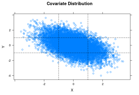
The horizontal and vertical lines are the cuts for classifying $X$ and $Y$ as low, medium or high. You can see the strong negative correlation between $X$ and $Y$ in the plot. If you look at the lower left and upper right rectangles, you can also see that the samples for the corresponding two histograms of $Z$ ($X$ and $Y$ both low or both high) are pretty thin, which suggests we should not trust those histograms so much.

Factors often hide variation (in arbitrary ways).


In some cases, factors represent something inherently discrete (such as gender), but in other cases they are used to categorize (pool) values of a more granular variable. In this case, I cut the original numeric covariates into factors using the intervals $(-\infty, -1]$, $(-1, +1]$ and $(+1, +\infty)$. Since both covariates are standard normal, that should put approximately 2/3 of the observations of each in the "medium" category, with approximately 1/6 each in "low" and "high".

To generate the plot matrix, I must convert $X$ and $Y$ to factors; I cannot produce a histogram for each individual value of $X$ (let alone each combination of $X$ and $Y$). Even if my sample were large enough that each histogram had sufficiently many points, the reader would drown in that many plots. Using factors, however, means implicitly treating $X=-0.7$ and $X=+0.3$ as the same ("medium") when it comes to $Z$. This leads to the next issue (my second "brain itch" when viewing the video).

Mixing distributions blurs things.


As noted above, in the original lattice of histograms I am treating the conditional distributions of $Z$ for all $(X, Y)$ values in a particular category as identical, which they are not. When you mix observations from different distributions, even if they come from the same family (normal in this case) and have only modestly different parameterizations, you end up with a histogram of a steaming mess. Here the conditional distribution of $Z$ given $X=x$ is $N(2x, 1)$, so means are close if $X$ values are close and standard deviations are constant. Nonetheless, I have no particular reason to expect a sample of $Z$ when $X$ varies between $-1$ and $+1$ to be normal, let alone a sample where $X$ varies between $-\infty$ and $-1$.

To illustrate this point, let me shift gears a bit. Here is a matrix of histograms from samples of nine variables $X_1,\dots,X_9$ where $X_k \sim N(k, 1)$.
Each sample has size 100. I have superimposed the normal density function on each plot. I would say that every one of the subsamples looks plausibly normal.

Now suppose that there is actually a single variable $X$ whose distribution depends on which of the nine values of $k$ is chosen. In order to discuss the marginal distribution of $X$, I'll assume that an arbitrary observation comes from a random choice of $k$. (Trying to define "marginal distribution" when the distribution is conditioned on something deterministic is a misadventure for another day.) As an example, $k$ might represent one of nine possible categories for undergraduate major, and $X$ might be average annual salary over an individual's working career.

Let's see what happens when I dump the 900 observations into a single sample and produce a histogram.
The wobbly black curve is a sample estimate of the density function, and the red curve is the normal density with mean and standard deviation equaling those of the sample (i.e., $\mu=\bar{X}, \sigma=S_X$). To me, the sample distribution looks reasonably symmetric but too platykurtic (wide, flat) to be normal ... which is fine, because I don't think the marginal distribution of $X$ is likely to be normal. It will be some convolution of the conditional distribution of $X$ given $k$ (normal, with mean $k$) with the probability distribution for $k$ ... in other words, a steaming mess.

When we pool observations of $X$ from different values of $k$, we are in effect mixing apples and oranges. This is what I meant by "blurring" things. The same thing went on in the original plot matrix, where we treated values of $Z$ coming from different distributions (different values of $X$ in a single category, such as "medium") as being from a common distribution.

So what is the takeaway here?


In Empirical Model Building and Response Surfaces (Box and Draper, 1987), the following quote appears, usually attributed to George E. P. Box: "Essentially, all models are wrong, but some are useful." I think that the same can be said about statistical graphs, but perhaps should be worded more strongly. Besides visual appeal, graphics often make the viewer feel that they are what they are seeing is credible (particularly if the images are well-organized and of good quality) and easy to understand. The seductive feeling that you are seeing something "obvious" makes them dangerous.

Anyone who is curious (or suspicious) is welcome to download my R code.

Sunday, April 21, 2013

The G Graphics Library

For a Java program I'm writing (which I think I've mentioned/groused about elsewhere), I need to draw a few layered network diagrams (essentially binary trees turned on their sides), with a bit of customization. Part of that customization is that I want edges to run horizontally or vertically only (with right angle bends as needed), and I want to control layout (spacing). The Swing graphical toolkit provides everything necessary to paint on the screen, but I'm reluctant to spend the necessary time learning the ins and outs of drawing/painting with Swing. So I did some searching for libraries that would sit atop Swing and either provide mechanisms specifically for drawing graphs and networks, or at least provide a "higher level" drawing interface.

I have used JUNG with good success in the past for other applications, but neither JUNG nor JGraph (a similar library) seemed to give me the layout control I wanted (or, if they did, I could not figure out how). Skipping over various other blind alleys, which had me wondering whether I would spend more time looking for a library than it would take to master Swing, I eventually found G, described by its authors as
a generic graphics library built on top of Java 2D in order to make scene graph oriented 2D graphics available to client applications in a high level, easy to use way.
Note the phrase "easy to use", which (along with layout control) was my Holy Grail.

G, which is released under the GNU Lesser General Public License (LGPL), is a bit sparse on documentation. There is no user manual that I can find, and the Javadoc documentation, while comprehensive, does not provide as much descriptive material as a beginner might want. There are, however, some two dozen demonstration programs, which allowed me to infer much (though not all) of what I needed to know. The rest came from trial and error.

Once the basics are mastered, G does indeed provide a fairly easy to use toolkit for building two-dimensional graphics. There are some design decisions which may or may not suit the user. As one example, G provides support for dynamically panning and zooming scenes (graphs), but zooming does not change font sizes; text remains at its original size while the surrounding drawing elements expand or contract.

Bundled with G are two other classes, again documented only by their Javadoc (and by invocations in the sample programs).  The Geometry class provides various utility methods for geometric calculations, including factory methods for generating arrows, circles, ellipses, rectangles, circular or elliptical sectors, and stars. The Matrix4x4 class provides support for various mathematical operations on images, including scaling, rotation and translation (shifting).

The current version of G was released in December of 2009, and I see no indication that development is continuing, nor did I see any links to support forums or bug trackers. I think that I did encounter a bug, but found my own workaround. The factory methods in the Geometry class typically have two or more variants, with at least one using "device' coordinates (directly corresponding to pixels on the output device) and at least one using "world view" coordinates (using an arbitrary set of coordinates established by the user for his or her virtual canvas). The convention in G is that integers are device coordinates and double precision values are world coordinates. I had no problem using world coordinates to generate rectangles and stars, but my attempt to generate circles using world coordinates resulted in clipped ellipses with at least a few lines passing through the center. The workaround was to take the center and one point on the perimeter of the circle (for convenience, chosen directly left, right, up or down from the center), transform them from world to device coordinates, get the radius in device coordinates by subtracting, and then use the device-coordinates version of the factory method to generate the circle.

All that said, I now feel fairly comfortable using G, and I appreciate the work done by its authors and their releasing it open-source.