Monday, September 19, 2016

Better Estimate, Worse Result

I thought I might use a few graphs to help explain an answer I posted on Quora recently. First, I'll repeat the question here:

In parametric optimization with unknown parameters, does a better estimator of the parameter always lead to better solutions to the actual problem?

Here we’re trying to minimize $f(x,\theta)$ with respect to $x$, but we don’t know the value of $\theta$. We may have several estimators of $\theta$, and we’re comparing them in a mean square error sense (or by some other loss function in general).
One would like to believe that better estimates lead to better answers, but the word "always" is a deal-breaker. Well, with one exception. The answer to the question is (trivially) yes if "better estimator" is interpreted to mean "estimator yielding better objective value". For mean square error or any other likely loss function, though, "better" is going to mean "closer to $\theta$" (in some sense of "closer"), and that's when things fall apart.

I'm going to take a couple of liberties in my answer. First, I'm going to change minimization of $f$ to maximization, just because it makes the pictures a little easier to interpret. Clearly that makes no meaningful difference. Second, I'm going to assume that maximization of $f$ is constrained. I can cobble together a similar but unconstrained counterexample by replacing the constraints with a penalty function (and assuming some bounds on the domain of $\theta$), but the constrained counterexample is (I think) easier to understand.

For my counterexample, I'll take a simple linear program in which the constraints are known with certainty but $\theta$ provides the objective coefficients:

$$\begin{array}{lrcl} \max & \theta_{x}x+\theta_{y}y\\ \text{s.t.} & x+y & \le & 3\\ & x & \le & 2\\ & y & \le & 2\\ & -x & \le & 0\\ & -y & \le & 0 \end{array}$$
I deliberately wrote the sign constraints $x \ge 0, y \ge 0$ "backwards" to fit Figure 1 below.


feasible region with constraint and objective normals
Figure 1

The feasible region is the polytope with vertices A, B, C, D and E. The dotted lines are (unit length) normals to the constraint hyperplanes. So $a^{(2)}$ is the coefficient vector (1, 1) of the first constraint, scaled to unit length, $a^{(5)}=(-1, 0)$ is the coefficient vector of the sign restriction on $x$ and so on. (I numbered the normals in clockwise order around the polytope, rather than in the order the constraints are written above.)

The red dashed vector represents a possible realization of the parameter $\theta$. Since we're maximize, $f$ increases in the direction that $\theta$ points, so for this particular realization vertex B is the unique optimum.

Note that $\theta$ in Figure 1 is between $a^{(1)}$ and $a^{2}$. This is not a coincidence. If $\theta$ is parallel to one of the constraint normals $a^{(j)}$, all points on the edge corresponding to that constraint will be optimal. If $\theta$ lies strictly between two constraint normals, the vertex where their edges intersect will be the unique optimum. This is easy to prove (but I won't bother proving it here).

Figure 2 shows this situation in the same two dimensional space. The five constraint normals divide the space into five circular cones, with each cone corresponding to a vertex. If $\theta$ lands in the interior of a cone, that vertex is optimal. If it falls on an edge between two cones, both the corresponding vertices (and all points along the edge between them) are optimal.
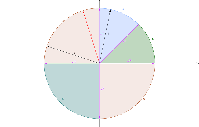
cones defined by the constraint normals
Figure 2
In Figure 2 I've drawn a particular realization of $\theta$ (deliberately not the one from Figure 1), and two estimators $\hat{\theta}$ and $\tilde{\theta}$. Unfortunately, I'm limited to raster image formats and not vector formats in the blog, so the plots get rather fuzzy if you zoom on them. You'll have to take my word for it that $\hat{\theta}$ is the black vector just above the negative $x$ axis and $\tilde{\theta}$ is the black vector just clockwise of the positive $y$ axis. Alternatively, you can click on the image and download it or open it. (The images have transparent backgrounds, so I recommend opening them in your browser, or some other application that will supply a background.)

By design, I've selected them so that $\tilde{\theta}$ is geometrically closer to $\theta$ than $\hat{\theta}$ is. That should make $\tilde{\theta}$ the better estimator of the two in terms of squared error, absolute deviation ($L_1$ error), etc. Unfortunately, using $\tilde{\theta}$ results in vertex B being the unique optimum. Using the true coefficient vector $\theta$, vertex A is optimal, and the seemingly inferior estimator $\hat{\theta}$ also falls in the cone where A is optimal.

Thus using the "inferior" estimator $\hat{\theta}$ gets you the correct answer, albeit with a somewhat incorrect prediction for the value of the objective function. Using the "superior" estimator $\tilde{\theta}$ gets you a flat-out suboptimal solution. In Figure 1, the incorrect solution B looks to be not too far (geometrically) from the correct solution A, but I could easily cook this example so that B is a long way from A, guaranteeing a massively incorrect result.

All that said, I would still gravitate to the more accurate estimator and not sweat the occasional pathological outcome. Sadly, though, there is once again no guarantee that doing the right thing leads to the best result.

Saturday, September 10, 2016

Hovering Over Shiny Plots

I'm following up on yesterday's post, "Formatting in a Shiny App". One of the features I added to my Shiny application was the ability to identify a point in a plot by hovering over it. Since I wanted to do this in several different plots, and did not want to reproduce the logic each time, I abstracted part of it out into a function. I thought I'd post the function here, in case it helps anyone else.

Without further ado, here's the function (including Roxygen documentation):


#'
#' Use hover information reported by Shiny to select a caption suitable
#' for the observation closest to the mouse (or no caption if the mouse
#' is too far from the nearest observation). Proximity is measured using
#' the 1-norm, after scaling abscissa and ordinate by the bounds of
#' the plot region.
#' 
#' @param hover the hover information reported by Shiny
#' @param x the vector of x values of observations being plotted
#' @param y the vector of y values of observations being plotted
#' @param captions a vector of captions (e.g., row names), of the same
#' length as x and y
#' @param tolerance the maximum distance (in the weighted 1-norm) that
#' a point can be from the mouse and be selected
#' 
#' @return if a point is within tolerance of the mouse location, the
#' caption corresponding to the closest point is printed (suitable for
#' capture by renderPrint)
#' 

hoverValue <- function(hover, x, y, captions, tolerance = 0.05) {
  if (!is.null(hover)) {
    x0 <- hover$x # x coordinate in user space
    y0 <- hover$y # y coordinate in user space
    xrange <- hover$domain$right - hover$domain$left
    yrange <- hover$domain$top - hover$domain$bottom
    # find the index of the observation closest in scaled 1-norm to the mouse
    dist <- abs(x0 - x) / xrange + abs(y0 - y) / yrange
    i <- which.min(dist)
    # return the corresponding index if close enough, else NULL
    if (dist[i] < tolerance) {
      cat(captions[i])
    } else {
      cat("...")
    }
  } else {
    cat("...")
  }
}

Here's how we apply this. In what follows, anything in CAPS is a totally arbitrary name you pick for an object. Somewhere in the user interface file (ui.R), we display a plot with

renderPlot("XYZ", hover = hoverOpts(id = "XYZH", ...), ...)

where the ellipsis is any additional arguments you need. (See the help entry for shiny::hoverOpts for options it takes.) This tells Shiny to look in output$XYZ for the contents of the plot, and to return information about where the mouse is hovering in input$XYZH. The structure of input$XYZH is a list of lists, and I won't go into all the details here.

On the server side, you pass input$XYZH as the first argument to my hoverValue function. The second (x) and third (y) arguments are numeric vectors giving the abscissas and ordinates of the plotted points. The fourth argument (captions) is a text vector of the same length as x and y, giving the caption you want displayed for each point. If x and y are columns from some data frame df, then row.names(df) would be a logical candidate for the captions.

Bear in mind that plotting a graph involves a transformation from what I'll call "user coordinates" (the scales on which the original variables are measured) to "screen coordinates" (something like pixels or millimeters from the edges of the screen area devoted to the plot). The hover data input$XYZH contains, among other things, the location of the point where the mouse is hovering in both "user" and "screen" coordinates. In order to figure out which point is closest to the mouse, we compute the distance (in user coordinates) from the mouse to each of the plotted points. I elected to use the 1-norm, but you could just as easily use the 2-norm or any other norm you like.

Because the x and y variables will typically be measured in different units, we need to use a weighted norm. I scaled them by the width and height, respectively, of the plot area in "user" coordinates, obtained from input$XYZH$domain. (There is another sublist of input$XYZH that has the left, right, top and bottom limits in "screen" coordinates, in case you wondered.) The last argument of the function, for which I provided a (very arbitrary) default, is the minimum required proximity to a point. If none of the plot points are this close or closer to the mouse location, we assume that the mouse is hovering in empty space, and return a placeholder string. (I used "...", but feel free to insert your favorite phrase.) If any points do lie at least that close to the mouse, the index of the closest one is selected, and the corresponding caption is coughed up. If input$XYZH is null (which I think it might be if no hovering is going on), the placeholder is again returned.

As noted in the comments, the caption is returned by "printing" it (using the cat() function). If this were a script running in a console, the caption would print in the console. Instead, in the server script (server.R) we use

output$XYZT <- renderPrint({hoverValue(input$XYZH, ...)})

to capture the "printed" text and pass it to the user interface, and in the user interface (ui.R) we use either

textOutput("XYZT", ...)

or

htmlOutput("XYZT", ...)

(depending on whether you want to apply any CSS styling) to show the caption.

Friday, September 9, 2016

Formatting in a Shiny App

I've been updating a Shiny (web-based interactive R) application, during the course of which I needed to make a couple of cosmetic fixes. Both proved to be oddly difficult. Extensive use of Google (I think I melted one of their cloud servers) eventually turned up enough clues to get both done. I'm going to record the solutions here, lest I forget them. Unfortunately, I can't give credit where credit is due; in the heat of trying all sorts of fixes (many of which did not work), I neglected to take note of the URLs for the ones that helped.

Centering Text


On the surface, this sounds trivial: just put it inside an HTML "div" or "span" tag, with appropriate style information. In my case, though, I was generating the text dynamically using the verbatimTextOutput() function. More specifically, I was positioning two plots side by side, with dynamic text under each one. In the UI file, this was done using a "fluid row" containing two columns of width 6 each. (I won't explain the spacing convention for fluid rows here. It's enough to know that the available width is 12 units, so this splits the row into two columns of equal size.) One plot, followed by the text, went into each column. According to the help for the column() function, the syntax is

column(width, ..., offset = 0)

where ... is the list of elements to include in the column. It turns out that column() also understands an alignment parameter, so

column(6, align = "center", plotOutput(...), verbatimText(...))

worked just fine for me. That's certainly simple enough, once you know about the align argument.

Aspect Ratio


My other challenge was a bit trickier. I wanted to control the aspect ratio of the two plots. The plotOutput() function has width and height arguments, which take (string) values that can be either a percentage of available space, an integer number of pixels, or "auto". Per the help entry,
Note that, for height, using "auto" or "100%" generally will not work as expected, because of how height is computed with HTML/CSS.
Truer words have never been written. Width defaults to 100%, which in the context of my two-column fluid row means that each plot scales fill half the width of the available space. That's fine. I want the plots to expand when the user expands the browser window (or goes to full screen). I tried both "100%" and "auto" for the height argument, and in both cases the result was that the plots had zero height (did not display at all). Oops.

Ideally, I would like to say something like "height = width" (for a 1:1 aspect ratio) or "height = 0.8 * width" (for a 5 : 4 aspect ratio). Unfortunately, the height is being handled by Javascript, not R code, and the Javascript apparently does not support expressions. So that left the option of computing the height in the server R code, but doing so requires knowing the aspect ratio (a constant) and the width of the plot, which is determined in the UI.

Once again, an undocumented argument (or documented in some sacred scroll not available to lay people) comes into play. Let's say that the identifier I use for my plot is "xyz". The UI contains the function call

plotOutput("xyz", height = "auto", ...)

causing the UI to look for the output to plot in output$xyz. The server script in turn uses

output <- renderPlot(...) 

to generate the plot. Here's the code that ended up working:
    output$xyz <-
      renderPlot(...,
                 height = function() {
                   aspect * session$clientData$output_xyz_width
                 }
      )
(where "..." is the code generating the actual plot and aspect is a variable containing the target ratio of height to width, 0.8 in my case). The list session$clientData contain stuff used by the Shiny server to keep track of one session versus another. (If you and I are concurrently running the same application, we each have a unique session, which is how Shiny keeps straight which data and results belong to you and which belong to me.) Apparently that list includes a numeric item giving the display width of output$xyz, with the name mangled to output_xyz_width for reasons unknown to me.

Using this code, the server script computes and sets the correct height for the plot, and apparently "auto" in the UI script tells it to defer to the height computed by the server.